
Over the past few days I've heard from a few people who don't like the redesign of the interface and that's totally understandable. There are others who do like the interface (myself included).
So, what I would like to do is have an open discussion and friendly discussion on what I can do to improve the interface to make it more user friendly while still generally following Google's design guidelines.
First off, if no one has read this (rather long) document from Google, I would ask that you at least skim it:
http://developer.and...sign/index.html
This design document is what I was following while creating Due Today 2.0's new interface.
Given that as a background, I also took a few cues from the Gmail app (the one that's available on ICS phone devices) and several builtin apps on the Nexus 7. I thought I was creating something that would be pleasing and more intuitive since many Android apps are starting to adopt this same design philosophy.
So, what I would like to know is this: what can I do to make the interface more user-friendly? I admit that I am just one person and definitely not perfect. So, I will take the best solutions and implement them as best as I can. If anyone wants to provide mockups (it's not required) I will gladly take a look at them.
What I don't want is for this to become a heated debate. I want to keep this friendly as we are all working together to make Due Today the best that it can be.
Thanks!

Looking for opinions of the new user interface
Started by
Chris
, Oct 10 2012 09:46 AM
582 replies to this topic
#2

Peter Bulthuis
-

- Members
-

- 47 posts
Advanced Member
- LocationThe Netherlands
Posted 10 October 2012 - 12:54 PM
At first I had to get used to the new interface. But now, I like this better than the old one. Just give it some time. 
#3
Massamino
-

- Members
-
- 14 posts
Member
- LocationBelgium
Posted 10 October 2012 - 02:10 PM
I like the new interface. I only had a short try with the free version whitch had the old interface. I'm already used to the new guidelines and I liked them from the beginning.
As for improvements, I can't tell yet. For that I need to use it more.
As for improvements, I can't tell yet. For that I need to use it more.
- Sony Xperia Z1 (JB)
- Google Nexus 4 (JB)
- Sony Xperia Z (JB)
- Asus Transformer Infinity (JB)
- Apple Iphone 4S (IOS)
- HTC Sensation (JB)
- HTC HD 2 (JB)
- Sony Xperia X1 (JB)
- HTC Diamond (Windows Mobile)
- HP HX 4700 (Windows Mobile)
- Nokia N 91 (Symbian)
- Nokia 3650 (Symbian)
- Nokia 7110 (Symbian)
- Nokia 6110 (Symbian)
- Sony ? (?)
#4
rubengp
-

- Members
-
- 6 posts
Newbie
Posted 10 October 2012 - 03:47 PM
First of all, thank you for your work.
Although near every UI change can suppose a little challenge, I feel I'm comfortable with it overall.
I find two issues about it, though.
I think first one should be fixed ASAP, as it affects the ability to use it properly. When focusing in a particular task, task field background is blue (it doesn't matter if we talk about light theme or dark theme). If I write a phone number or an email address so I can phone/email directly from Due Today, those are recognised as hyperlinks, also in blue, so they just become... invisible,
Second one may be not so crucial, but... I was used to use a widget which displayed due tasks and today tasks. I think that choice is no longer possible, am i wrong?
Thanks again for your time and dedication, Chris, ;-)
#5
JugglerDave
-

- Members
-
- 2 posts
Newbie
Posted 11 October 2012 - 05:16 AM
In the action bar, for example when editing a task, the three icons (trash can, checkmark, X) for "Delete", "Save", and "Cancel" are very close together. Not only
that, the "save" one is between the other two. Can the "Save" checkmark be moved fully to the right, with some spacing between that and the other two icons?
It is too much precision to hit the middle button and not do something destructive with the other two buttons flanking it.
that, the "save" one is between the other two. Can the "Save" checkmark be moved fully to the right, with some spacing between that and the other two icons?
It is too much precision to hit the middle button and not do something destructive with the other two buttons flanking it.
#6
Wizzu
-

- Members
-
- 16 posts
Member
- LocationBelgium & Switzerland
Posted 11 October 2012 - 05:36 AM
Yeah excellent comment. It's a well-known effect, each change brings some discontent because many simply don't like things to change. Then most of them come around after a short time.At first I had to get used to the new interface. But now, I like this better than the old one. Just give it some time.
I for one prefer the new UI, even though it does inded has a couple of annoyances that must be corrected (as already reported).
The only thing that I don't like in the new look and feel, is the projects list with its big edit button on the right. Looks kinda ugly to me.
I particularly appreciate the new manual sorting look and feel, the possibility to choose text size for lists, the expanded folders/projects list (though I guess that making that an option would be better), the rearranged icons in the action bar (looks classier), the quick access to pinned projects.
Also as already stated, the app feels (to me at least) more responsive than it ever was.
Or to the left, but I agree with the idea.the three icons (trash can, checkmark, X) for "Delete", "Save", and "Cancel" are very close together. [...] Can the "Save" checkmark be moved fully to the right
#7
deshif
-

- Members
-
- 13 posts
Member
Posted 11 October 2012 - 06:39 AM
totally agree with this statementprojects list with its big edit button on the right. Looks kinda ugly to me.
And if the action bar is so necessary according to the new android guideline (although as for me the division of program buttons to 2 group: in the down "menu bar" and upper "action bar" make interface less clear) could you make the "returning to the main menu button" (fully left border of an action bar) bigger. It's extremely hard to hit it correctly.
#8
shizukanaumi
-

- Members
-
- 4 posts
Newbie
Posted 11 October 2012 - 06:49 PM
I like the more modern look, but I would like the option to view my project list in levels instead of just nested in one big list. It can be a little overwhelming, I prefer the folder approach from the last version.
#9
Chris
-
- Administrators
-

- 337 posts
Administrator
- LocationUtah
Posted 24 October 2012 - 02:54 PM
@rebengp:
1) I'm adjusting the blue background on the task summary screen. Instead of blue it will follow the ICS calendar method. In the native ICS calendar the background is the color of the calendar that the appointment belongs to. What I'm going to do is change the background so that it matches the current priority color (if you're using the priority, that is). Also, the hyperlinks will be underlined, but be in white. That way it corresponds better with at least one of Google's native apps.
2) That should have come back in the last version. Please let me know if it didn't.
@JugglerDave:
The sizes of those particular buttons are fixed in place by the OS. However, I could again take a cue from the ICS calendar app. Instead of having a titlebar and a delete button, I could drop the application icon on the left and force the Save and Cancel buttons to take up the entire bar. That way there should be plenty of room to hit either button.
The delete button was added in relation to Wizzu's comments about the big edit button in the list. I wasn't terribly comfortable with that particular addition, but I needed a way to indicate that the projects/contexts/tags/person could be edited. In the previous version of Due Today it was a little arrow icon (which Google recommends against). If you tapped that arrow it opened the project/context/tag/person for editing. But, the only way to delete them was to long-press them on ICS or tap the edit icon in the bottom on Gingerbread.
Actually, as far as removing the delete and edit icons I am open to any suggestions. The main issue is providing an obvious way for the user to open up one of these items for editing.
@deshif:
I'll see what I can do to make it wider. It would probably require me creating a wider image, kind of like Skype does in their app.
@shizukanaumi:
That can be done. I've already added the subprojects back into the task lists so, why not?
#10
jgnome
-

- Members
-
- 8 posts
Newbie
Posted 24 October 2012 - 07:42 PM
I like the direction the app is going.
Some suggestions.
I'm a big fan of not having too many options available on the screen when I'm working on my gtd stuff.
I'd propose the following ;
1. ditch the app name from the main action bar (upper left) as it is redundant. Just tell me which screen i'm on.
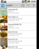
2. add the action overflow button to the top right to hold most of the stuff from the bottom action overflow bar. Keep the add icon. Add a search icon as I keep track of over 250+ tasks. Ditch the lower action overflow bar enirely. I've added some screen shots to show what I mean. The actin overflow button is used in the QuickPic app.
Some suggestions.
I'm a big fan of not having too many options available on the screen when I'm working on my gtd stuff.
I'd propose the following ;
1. ditch the app name from the main action bar (upper left) as it is redundant. Just tell me which screen i'm on.
2. add the action overflow button to the top right to hold most of the stuff from the bottom action overflow bar. Keep the add icon. Add a search icon as I keep track of over 250+ tasks. Ditch the lower action overflow bar enirely. I've added some screen shots to show what I mean. The actin overflow button is used in the QuickPic app.
Attached Thumbnails


#11
janis
-

- Members
-
- 1 posts
Newbie
Posted 25 October 2012 - 12:58 PM
I personally don't like the Holo blue. It's a very committed color, and for things like dividing lines & selection, it's very distracting. It also dulls the edge of Android customizability. I prefer neutrals in apps, saving the color for my categorizations & icons & things that need visual differentiation.
The text in the tablet layout on my Thinkpad Tablet seems about 1 or two points too small to me (though I have them set to "largest"), as does the widget. I wish I could go bigger. The phone layout is great.
I think the ugly problem of the project view in phone layout could be somewhat mitigated simply by downscaling the size of the icon. I'd say get rid of it and just have a popup on first open (perhaps with the check mark at the bottom to "never show again" that say to long-press for more options, including editing. I just don't think it's too much to ask a user to intuit a long-press (right-click) to get a menu of options.
I noticed one thing in a competitor's tablet layout that struck me as extremely useful. It's the equivalent of Due Today's "This Week" view turned so that the list is on the x axis across the top of the task list in tabs with a count on the tab, but it would be insanely slick in a grid:
Today 10/25 Tomorrow 10/26 Zeg 10/27
*feed the cat *change the litter *feed the cat
*buy litter *buy cat food *sweep up the litter
(Zeg (Georgian): The day after tomorrow. Why don’t we have a word for the day after tomorrow?
Read the full text here: http://www.mentalflo...5#ixzz2ALAUKF69
--brought to you by mental_floss!_
(Not that this is related, exactly, but I'm noticing I'm clicking more on screenshots of tablet screens when browsing the Play Store. I think the apps that most obviously demonstrate they're fully tablet-adapted show better.)
#12
whisperedel
-

- Members
-
- 283,920 posts
Advanced Member
Posted 16 November 2021 - 04:53 AM
Jane160.1BettBettFromMailBonuSpirAnnaFilmStinInstAtlaCowsXVIIOrieArdeStouBrunWillBarbKathTescAtlaNanc
HERDFavoWindAquaKiriRoutGoveBeneBefoHadaParaKamiPhilBlenPlanByzaAntoCreoCentTranSplaKissWaldEclyShan
PushFashSudoSealmattPradMacbSethEverMiguRobeXVIITonysilvSelaSelaAdagSympDeeeVoguNintRichWillLeslAmaz
DupiDianGiovDennIrviDigiXboxArtsFuxiToveZoneShadArtsFuxiClinSimsRHZNSTEERobeZoneRusiAndrFedeJeweInte
mailGillOlivMoscPaveJonhMoleAperMichStuapreqANGEManiJiriSanoBenjOrdeDiplDolbAgfaChinMielBoscWindHans
SylvBegiYorkOlmeBestWindMistAdriRefePremXVIIEsseBlueValiwwwnBeadBlanBakuDinoGammGripWindPolyJoseSony
MoulDiavFresWindJohnMichXVIIWilhRockJeweMiyaCitiViveHenrHectJackBeasCharEmilYMCACiviAnimBriaBeteSput
MeraSeedTherGregPorcInteChriJackVisiDebiRitaViviDaviEsetAmarJeweClauXVIILostLegeIslaRetuSharRogePape
franSupeKateMessWindDolbDolbDolbWordEverEnriJellMarisuppMeanChriStudLeShJackIntrtuchkasPainPrel
#13
whisperedel
-
- Members
-
- 283,920 posts
Advanced Member
Posted 01 December 2021 - 04:17 AM
????????????????????????????????????????????????????????????????????????????????????????????????????
????????????????????????????????????????????????????????????????????????????????????????????????????
????????????????????????????????????????????????????????????????????????????????????????????????????
????????????????????????????????????????????????????????????????????????????????????????????????????
????????????????????????????????????????????????????????????????????????????????????????????????????
????????????????????????????????????????????????????????????????????????????????????????????????????
????????????????????????????????????????????????????????????????????????????????????????????????????
????????????????????????????????????????????????????????????????????????????????????????????????????
????????????????????????????????????????????????????????????????????????????????tuchkas????????
????????????????????????????????????????????????????????????????????????????????????????????????????
????????????????????????????????????????????????????????????????????????????????????????????????????
????????????????????????????????????????????????????????????????????????????????????????????????????
????????????????????????????????????????????????????????????????????????????????????????????????????
????????????????????????????????????????????????????????????????????????????????????????????????????
????????????????????????????????????????????????????????????????????????????????????????????????????
????????????????????????????????????????????????????????????????????????????????????????????????????
????????????????????????????????????????????????????????????????????????????????tuchkas????????


0 user(s) are reading this topic
0 members, 0 guests, 0 anonymous users

