

I haven't had much time to work on this lately, but I've recently come up with a new possible design and I'd like some opinions.
In the current version there is the "orb" menu in the upper-left corner. For version 2 I'm choosing to go with a new menu design. Here is a mockup of what I was thinking:
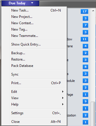
Is this acceptable or would everyone prefer a more traditional menubar with toolbar actions?
Secondly, I was thinking about the left-side design and was thinking of moving the focus, project, context, ... buttons from the toolbar (in order to minimize its height) over to the left, like this:
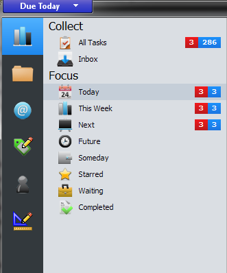
The nice part about this is that it would support drag and drop properly so you can more easily move tasks from projects to contexts, etc.
The other way I was think was to combine everything into a giant list in the sidebar, but I had originally tried that with version 1 and it wasn't too popular.
Either way, I would like to hear from everyone on these designs. And, if you have better suggestions I welcome those, too. I want to make the workflow a lot more streamlined and better for everyone.
Thanks!